The Do’s and Don’ts of Font

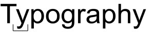
When it comes to your labels, window stickers or your floor stickers you want to make sure that they get your specific message across. When choosing typography you want to make sure that they are legible, noticeable and complement the design perfectly; here are a few handy tips from us at Customark:

Fewer fonts make more impact

Using more than 2 fonts can make any design look too cluttered and hard to read; we find that sticking with a bold design for the main attraction and then a simple type of typography for anything else makes the design look cleaner.

Font types

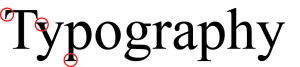
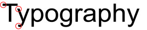
The most common forms of fonts are Serif and San Serif. Serif fonts include little embellishments (serifs) at the end of each stroke (Bookman Old Style, Georgia, Times New Roman). San Serif (meaning “without serif”) fonts are the ones without (Calibri, Arial, Gill Sans). Serif fonts like Times New Roman are seen as more traditional, whereas San Serif fonts like Arial are seen as more modern.

Serif
San Serif

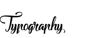
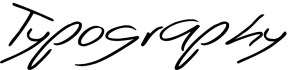
You can also use Handwritten and Script fonts for effect. Using them sparingly is always the way to go and avoid using them with large bodies of text as it can become very illegible and quite cramped very easy.
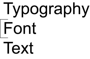
Good example of handwritten / script
Bad example of handwritten / script, depending on the situation

Size

Getting the size right with text is very important; too small and it can become hard to read but too big can also overpower and outbalance your design.

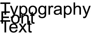
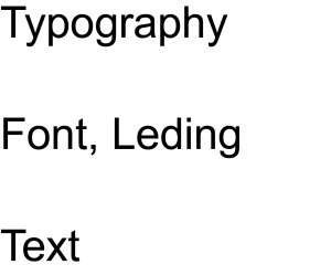
Tracking, Kerning and Leading

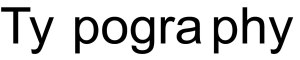
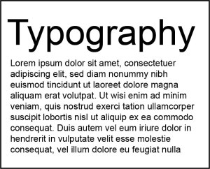
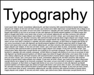
Tracking is the spacing between each letter of one work, too small and it can blur into one; too much and it can become too spaced out and hard to read. Kerning is sometimes confused with Tracking as they are both to do with spacing, but instead of one word it is between two letters. Set too closely together, letters are unclear;  set too far apart and they are awkward to read. Leading is the spacing vertically in lines, so between the lines in a paragraph. Like Tracking and Kerning getting the balance right is crucial for the legibility of the text.

Tracking:

This is where will change if you adjust the Tracking
This is Tracking being too close together. It will make words merge into one
This is an example of the Tracking being too far apart, depending on the situation this can be used and look quite modern and presentable

Kerning:

This shows where you will find Kerning


This is when the Kerning between two letters is too close together, as you can see certain letters do become hard to read
Having the Kerning too far apart can make words look too spaced and awkward to read

Leading:

Here shows you where Leading is in a paragraph
This is an example of Leading being reduced too much
Making the leading too wide can make reading paragraphs very frustrating

Colour

There are many things to think about when choosing colours. What is your background colour? Will it clash? Will it blend in too much? Is it too bright? Who is your audience? Are they affected by colours like colour blindness or are they partially sighted?

A simple black and white theme is always a safe choice
People with sight problems will have a hard time reading this coloured font on a bright background
If you have a bright background like yellow a dark coloured font we find is best as it stands out
Picking a colour that is too close to your background colour can affect the legibility
This is a good example of fonts standing out on your background colour

What space you have to work with

If you have got limited space to work with you do not want to overfill it with text and risk compromising the legibility of the writing, make sure you think realistically with the sizing and the amount of information you want on it.

The amount of text has not affected the readability or legibility
The first thing you notice about this example is that there is too much text and it is far too small. Here we would try to minimize the amount of text on the graphic

We hope you found our Typography tips helpful; remember for any design advice we have an in house Artwork department to help with any questions.

Call:01384 264700 or email: sales@customark.co.uk

Do you really understand PAT testing?

What does PAT mean? Is it important?

Portable appliance testing, also known as PAT, is the examination of electrical equipment and appliances to guarantee that they are safe for use. Visual inspections will find most faults but a few types of defects can only be found by testing. As important as actual testing is, it is also essential to know that visual examinations are just as important as there are faults that cannot be found by testing alone.

By law, do I need to have my electrical appliances tested every year?

Any electrical equipment that has the potential to cause harm should be maintained in a good, safe condition; this is part of The Electricity at Work Regulations 1989. Nevertheless, the Regulations do not specify what needs to be done, by whom and how frequent it needs to be done. They do not make inspections or testing of electrical appliances a legal requirement, nor do they make it a legal requirement to do it annually.

As it isn’t a legal requirement, how often should I test my appliances?

This all depends upon the type of equipment and the environment it is used in. For example, a piece of machinery in a busy factory needs to be tested more frequently than a desk fan in one of the offices.

Do I need to keep records and should I label any appliances that have been tested?

As testing the equipment is not a legal requirement, neither is keeping a record or labeling the equipment that has been tested. On the other hand, a record and / or labeling can be useful for monitoring and reviewing the effectiveness of any maintenance scheme that you may have in place and to show that said scheme exists.

Do I need to get an electrician to do any portable appliance testing?

The person that is doing the testing needs to be knowledgeable to do it. In many low-risk environments, a sensible member of staff can undertake visual inspections if they have enough training and knowledge. However, when undertaking combined inspections and testing, a much greater level of knowledge and experience is needed. They will need:

Does new equipment need testing too?

No this should not require a portable appliance test, but a simple visual once over is always recommended.

Where can I buy the relevant labels?

You can purchase different type of Portable Appliance Testing labels from us at Customark Ltd.

To find out more visit our Component Test Labels website!

All information was provided by HSE (Health and Safety Executive) and can be found on their website.